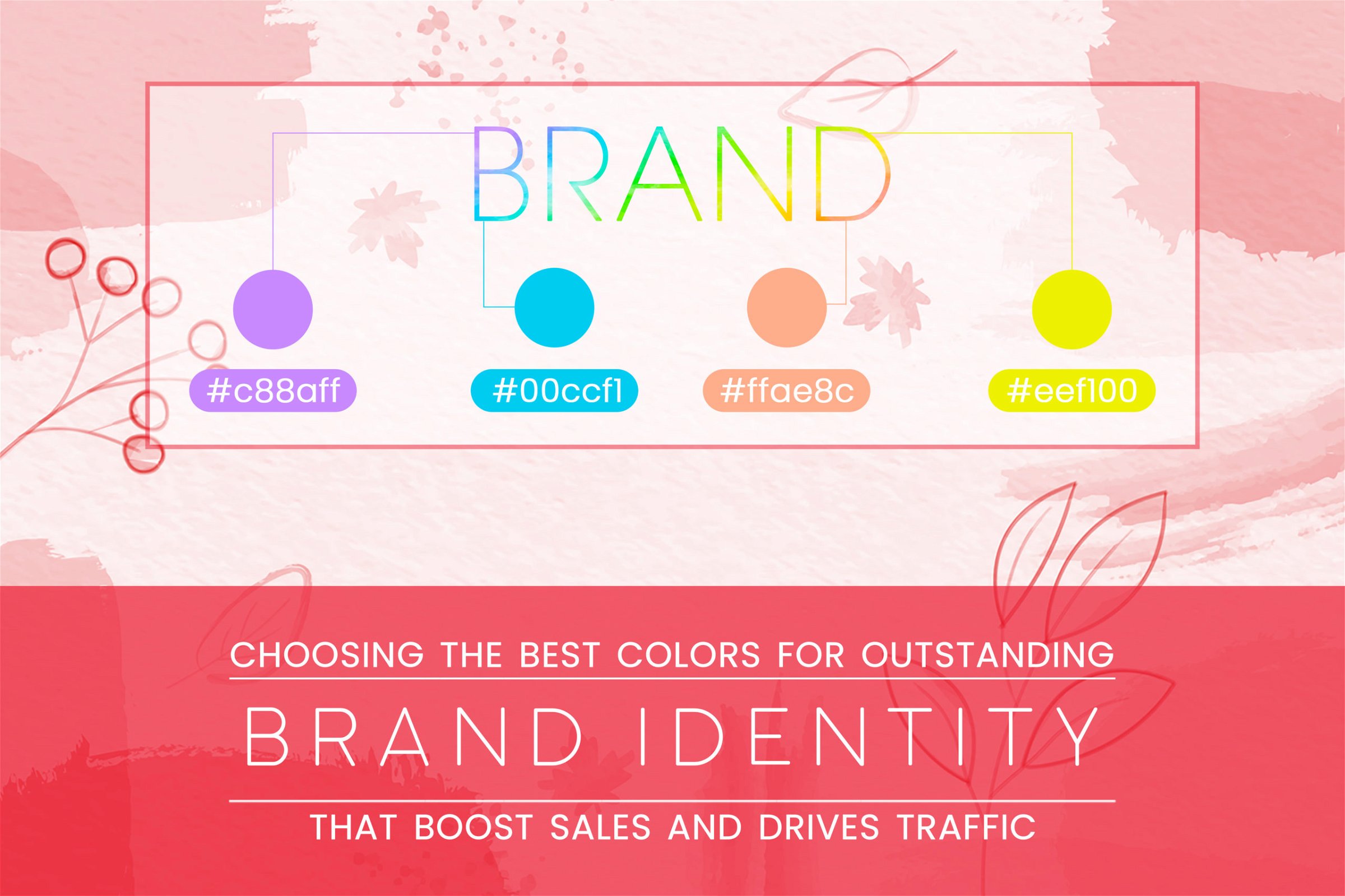
Not every person understands the importance of colors.
We often feel connected to any image because we like the way colors are used or the formation of shape at the background. But do you know that for a brand, the most important aspect is the colors- how it is seen in the outside world.
It is interesting to note that on average brand takes 4 weeks to six months to finalize the brand color. It is that crucial!
After all, these colors are going to talk to your customers and establish a brand identity. It conveys emotions, feelings, and experiences. It represents a core principle of branding that infuses the customer with a felt sensory experience wherein a person tends to build emotional connect
How do you choose the right color scheme for the brand?
As a brand owner and manager, it is very important for you to define what your brand stands for. Once you have clarity on brand persona, the colors are selected along with the fonts and icons to be used.
These elements tend to represent the brand personality like industry, primary audience, product category etc.
The colors used for any brand trigger positive associations like friendly, comforting or positive. In short, we can say that the brand colors define the future of the brand.
It is important for business owners to know their target market and to whom they offer their services or products so that the color will also be appropriate to the kind of encouragement needed for the target customers.
Define colors
Red – strength, aggressive, passion, boldness
Blue – regal, authority, dignity, security, faithful
Orange – fun, cheeriness, warmth, positivity
Green – environment, tranquillity, health, freshness
Pink – femininity, innocence, softness, health
Yellow – optimism, motivation, energy, cheerful
Purple – sophistication, spirituality, royalty, mystery
Brown – earthiness and subtle richness
White – purity, truthfulness, contemporary, refined
Black – somber, serious, distinctive, bold, classic
Grey – authority, practical, conservative
There are two main ways through which people derive the meaning of colors: natural association and psychological/cultural association.
1. Natural association is the inherent association of colors in the natural world (the color of the ocean, sky, trees, etc.) to their biological attributes.
2. Psychological / Cultural association is the meaning we attach to colors based on what we’ve been taught through culture and/or religion. Also, each color holds a different meaning in different parts of the culture.
Note: The demographics and psychographics will be an important consideration in selecting the color that represents your brand in markets the brand serves.
Color theory helps us to understand how culture, gender, religion, and current market trends affect our perception of color, ultimately ensuring that brand colors are congruent with the message intended for our audience.
What is the right color palette?
An added, critical aspect that needs to be considered while choosing the right color palette for a brand is accessibility.
- Make sure to include appropriate contrasts. Good contrast between the color of the text and that of the background improves visibility and readability.
- Look out for any additional cues that might be necessary when using color to represent information. This aspect is important when you have to visualize any kind of data.
Conclusion
Remember, your brand colors are of utmost importance for your business. Even if it takes some weeks to finalise then it is worth it (the pain!). Go that extra mile to pick the colors which denote your brand’s thought process and match with the vision.
Your customer is going to build a connection with the colors you are going to market with. That’s how you do brand marketing.
Get to know more about it while getting a free consultation from the BrandDost team.


